On Wednesday, Republic FC announced Dustin Avilla as the winner of the 2020 Fan Can design collaboration between the Indomitable Club and New Glory Craft Brewery.
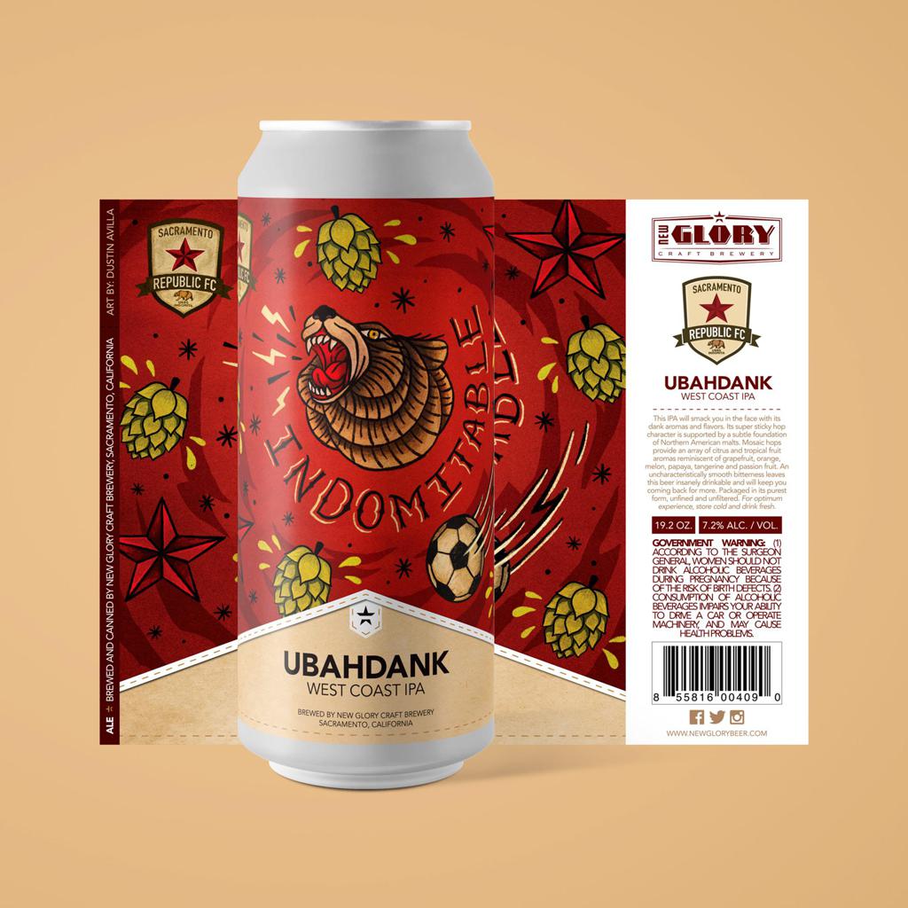
Avilla, a Sacramento State graduate and local graphic designer, created the design for the Ubahdank IPA can to be sold at both the New Glory brewery and all SRFC home games during 2020. Unless the brew sells out completely, just like it did in 2019.
The artist, who grew up in Napa but currently resides in Natomas, took signature elements from the brewery and the club and created something uniquely Sacramento. The can design captures the key ingredients of the club’s crest – the star, the bear – as well as the quintessential mosaic hops that give life to the Ubahdank IPA itself. The swirling soccer ball, vibrant shade of Old Glory Red and the roar of the bear perfectly embody the passion that can be experienced at matches as well as the passion that went into making the beer.
Before the brew finds its way into the hands of thirsty fans this season, let’s get to know a little more about the artist behind the remarkable design…
Can you talk a little bit about your art background?
“I’m currently a freelance graphic designer. I went to the Sac State and graduated from their design program in 2011, so I’ve been doing graphic design for a while now. Once I graduated, I moved to New York. I lived in NY for four years and while I was there, I worked for the SYFY channel, so I got to work on some really interesting projects there. I worked on a lot of custom press kits for when a new TV show comes out so it was my job to find a way to send out the pilot episodes so we would create a really cool and unique custom package and that’s how I really got into the niche of print design and packaging. I’ve been doing design for about 10 years now.”
When did you first find your passion for art?
“At a pretty young age. I used to always draw when I was little, I would collect comic books like Spiderman, X-Men, and I started out trying to draw the characters like Spiderman. I always tried to draw him. In high school, I took some drawing classes and some art classes and I took that all the way through college. I didn’t really know what graphic design was at the time but once I quit football graphic designed seemed really intriguing so I learned more about it and kind of just fell in love with it.”
What brought you to Sacramento?
“I grew up in Napa and I played football and was recruited by Sac State. I played there for a year and then ended up getting up injured so I kind of had to find a new passion and art was always something that I was interested in. That was how I found the graphic design major after football. After working in New York, I moved back to Sacramento where I’m still doing graphic design today.”
When you first heard about the contest, what was your initial thought?
“I’ve seen a few concepts like this that I wanted to do, so when I saw the Sac Republic and New Glory contest pop up, I was already in that mode and was excited. I’ve always known about Sac Republic and I’ve been to several games and with so much excitement around a new stadium and MLS future, I thought this was a great opportunity to be a part of it. It’s amazing to see New Glory and Sac Republic and the art community all come together to collaborate on this one piece.”
What was your inspiration for the can?
“I aimed to merge signature brand elements from both Sac Republic and New Glory in a way that created excitement and captured the club’s indomitable spirit. For New Glory, I incorporated the use of pattern and a repetition of the hops graphic – something that’s very signature to the original Ubahdank artwork. Then pulling in the elements from Sac Republic – the bear front and center, the star from the crest, and a flying soccer ball to emphasize a sense of movement and energy throughout the design. I wanted it to have that art-feel to the label, so I went with a traditional tattoo style and that was inspired by Northern California. I feel like that’s the style that really lends itself to the stars and just trying to capture that art community as a whole.”
What was the first impression when the judging group saw it?
“They were pretty stoked about it. They said this is exactly what a collaboration between Sac Republic and us would look like. They thought I really nailed merging the two styles into one.”
How are you feeling waiting to see the finished product?
“I’m excited to see it. I’ve been working with New Glory refining it, making small tweaks here and there but I’m really excited to see it out in the wild.”


